Fantasy

This might surprise you, but my fantasy has never been to be famous. My fantasy is to be average. OK. As a public opinion researcher I truly understand what that is. So maybe just slightly above average.

I remember driving through the mountains of North Carolina in my 20’S and seeing a trailer nestled sweetly in a valley and thinking that the person who lives there works in a furniture mill. I would fantasize for hours about how their alarm clock would go off and they would get up for their shift.

But I never wanted to wake up in the morning and look in the mirror and do this. In 43 minutes.

Self Portrait With Sweater.jpg

Self Portrait With Gray Sweater

There’s something strange in the air today … I woke up with a profound sense of “difference” in the world … as if I went to sleep in one reality, and woke up this morning in an entirely different universe. It’s not a bad feeling … just very odd. So … what’s a painter to do… Self Portrait in Favorite Gray Sweater. Have to say I like where the hair is going!

Self Portrait With Sweater.jpg

Buster In Progress

Here’s a new piece, Buster, after the first work session. My dear friend Rheta Grimsley has commissioned a couple of pet sketches in the past, and we are surprising her husband with this new one for Christmas. Rheta is a fabulous dog lover, one of her books is a dog memoir … wonderful story … so I consider her sort of an expert. Having her consider my dog sketches collectable is a big compliment. I’m so thankful for that.

buster wip.jpg

The Glorious Indifference of Purpose

I started this riverscape yesterday evening … prep sketch for the “Sandbar” commission I’ll start later in the week. This picture is 24x20, much smaller than the commission will be, and covers only the focal point of the scene. As simple as this composition appears to be, it’s still vital to work out any drawing problems before ever starting the larger picture. No matter how beautifully rendered, a representational painting with underlying drawing deficiencies will never suspend the disbelief of the viewer.

This storied location is beloved to me. You are looking due north up the Chattahoochee River where it forms the border between Georgia and Alabama — Georgia’s west coast — the view from the bridge connecting Fort Gaines to, a few miles away, Abbeville Alabama. My studio was atop the bluff that rose 80 feet above this sandbar. The little studio building, constructed of reclaimed materials from the region, was outfitted with wavy glass windows all along the river side and the longer north wall. The windows came from a restored Victorian … why they wanted to replace the beautiful old ones still baffles me … but I was happy to have them. I did some good work in that studio, and still miss the place.

Years ago the sandbar was a forbidden destination for adventurous teens. Most of the locals have tender memories of the place … coming of age, party stories from a different time. I hiked down there once or twice, but the old river road, abandoned years ago, is almost completely covered over, and was passable (with difficulty) only in winter. In the early 1900’s Fort Gaines was a thriving river port, and the bluff was buzzing with wharfs and warehouses … and, from what I have heard, lots of border-town style misbehavior. After all of that …. the sandbar remains. I think that’s why I love rivers so much … they just keep going where they’re going, with the glorious indifference of purpose.

Sandbar sketch.jpg

How To Pay For This

The two or so years I studied with Ben Long were life changing. I learned so much that I literally became a different person. My life would never be the same.

I asked him once how I could repay him. As an apprentice, I worked for him, so I did not pay for instruction. He said that I had been given sacred knowledge, a tradition that has been passed down for centuries, and it is my absolute obligation to teach, to keep the tradition alive. I haven’t done much teaching, mainly because I hate telling other people what to do.

Thursday I gave my dear friend, lawyer/painter Bucko, a traditionally prepared linen board to try. He is completely self-taught, but very talented, much more than he realizes. I think I may see in him what Ben saw in me. In addition to painting, he and Mary Nell have an amazing art collection hung salon style … that’s the real sign of a good eye.

So today over coffee I sent him some thoughts on how to approach the day. I am reprinting those notes here thinking that may, in some small way, move me in the direction of teaching. Below is the aforementioned canvas in his studio this morning (complete with Alia footprints) …. ready to go.

Good morning, painting buddy. You mentioned that you might try out the new linen board today. Here are a couple of things to consider:

  • The preference for linen in portraits stems from the tight twists in the treads … much more than cotton. Optically, these twisted fibers are the best for creating the illusion of volume. I have no idea why that is true, but it is. Great portraits are almost always rendered on linen.

  • Boards are great for layering. Even with wet-into-wet painting (that’s what you do as compared to wet-on-dry as I do), you’ll find more interesting possibilities for building a dynamic color experience. Since you already create a great color experience, this will be an easy refinement for you. You have a great eye for color already.

    • As you first start composing the image, use bristle brushes … something stubborn that will get the first layer of paint down into the recesses of the linen. Scrub the paint into the grain on that initial layer, and don’t use thick layers at first. This is called scumbling.

    • I think it’s best to scumbling out the entire composition at first. Get the drawing established before you have gobs of paint on the surface.

    • In my technique, I let this first layer dry before going back in to finish, but you don’t have to do that. Just get the drawing layer stumbled in, and then go back in with the dynamic top layers.

    • Use complementary colors for the first layer. For example, if you are painting a red apple, do this first under-layer in green. Trust me on this… allow tiny bits of green to show through under the red … and the result is not just red, but LIVING RED! This is one of the great secrets for getting objects that FEEL real, even if they are rendered in a very painterly fashion.

  • If you don’t like what you do on this first day, just wipe it off. Even if you have some remaining color on the board, that’s fine. It’s called a toned ground. I almost never paint on white canvas; I always tone the ground.

  • Square compositions can be very interesting. Frank Lloyd Wright loved squares in construction, and said that the square has integrity. I know you are an impatient painter, but before you start, take some scrap paper and sketch out (very roughly is fine) where you want things. I think for this first square it might be best to do something focused, like a still life. Probably not best for a landscape at first. The square focuses attention on the objects. You may not want to put the focal point of the painting in the dead center of the square. I think a slightly off-center composition is often more energetic.

  • Have fun!

IMG_2838.jpeg

Honey

So pleased that Joni loves the painting of Honey. We decided to skip the bees originally planned for the piece … she has other pet sketches, and this background will be a better fit with the collection. I’m so fortunate to have quite a few commissions this year … mostly for holiday events and gifts … Thank You Universe.

Honey.jpg

God I Love it So!

She’s done. Birth of Venus, my third painting on this theme. It was over a year ago when I started this one …. and what a year it’s been! I guess all things happen in their own time as the convergence of so many vectors.

These last few days I’ve explored how her expression can shift with the smallest changes, the tiniest marks. And now, every time I look at her I feel something different — wonder, fear, mystery, desire, peace, youthful indifference — I guess over time I’ll know more about that — beauty has so many dimensions. The home stretch of a project like this is always intense … these last days of work have been emotionally charged and I’ve thought of very little else. I love it when that happens — it is what I live for.

Photographing this painting has been impossible. Guess that’s mainly because the iridescent gold background absolutely does not read correctly … clearly this one will need a professional photographer.

The symbolism in this painting is highly personal; I can only hope it translates universally. At the very least, I hope you are struck by her beauty.

On a deeper level, the primordial sea is below and divine light above. The flowers, a nod to Botticelli’s masterwork, represent the unfolding of material reality. Beauty, like love, is a force — not an emotion or an opinion — it shines with original light. Gold reaches down into the dark water of possibility like the fingers of God. The shadow boxes with each of the flowers are Platonic forms come into expression … I guess the sea could be thought of as the cave in Plato’s allegory, but I see it as the opening to the cave … the moment of illumination … the opportunity to choose. The flowers, like Venus herself, emerge from the sea as matter … as beauty we can see. Upon seeing her we feel the magic of original light, but that is only because that light already exist within us. It connects with us because it reminds us who we are. As one of my spiritual teachers often reminds me “You don’t fall in love; you don’t find beauty. Your circumstances may cause you to ‘feel’ that you do, but they simply open a door that is inside you. You can access the divine inside yourself anytime you want. You can feel love just by feeling it; you can see beauty anywhere you look for it.”

So maybe it is The Good Fight to open that door … to share the magic of beauty. I wonder all the time why I paint, and I guess the best explanation I can come up with it this: God I love it so!

Bith of Venus.jpg

Signing Ritual

Venus is at the gate … just a few more glazes to finish … maybe fiddle with the flowers. But I have to put her away for a few days to get back to some commissions … as my teacher used to say, “time to feed the babies.” Tonight I’ll have my customary signing ritual … my first in the StudioKitchen. Steak for dinner, with lemon and olive oil, salad and then Scottish shortbread cookies with espresso for dessert. And then I’ll sign … time for a new signature, at least for this one painting … I saw it in my sleep last night.

Venus sign.jpg

Venus' Evolving Expression

… Good day of work on Venus … even though I’m leaving her with a muddy color underpainting for the evening, it’s been a blast to tweek the expression all day … and experience how the tiniest marks can change the feeling of the piece.

Venuswip.jpg

Landscapes

I’m excited about an upcoming landscape painting, a commission for a friend and collector … a riverscape called Sandbar. The canvas … she wants a specific size … has been assembled, stretched with coarse linen, and primed with lead white. Because the linseed oil based ground (a primer basically to keep the oil paint from coming into direct contact with the linen fibers) needs to cure for a couple of weeks, I’ve got some time to consider how I want to execute the piece.

Like portraiture, I use a couple of different styles in landscape painting. One is a sketchy, colorful style — executed as “painterly,” which means you can clearly see that it is a painting — evident brush strokes, relaxed approach to the underlying drawing. The other style would be described as “realism,” either classical realism (think Constable) or contemporary realism (think Hopper). If I’m doing a quick plein air sketch, it will certainly lean toward painterliness. Studio work, using sketches and photographs as source materials tends to lean toward realism. But realism is a spectrum, and with landscapes I’m not anchored … I never automatically fall into a specific voice range. Probably shouldn’t admit it, but when it comes to landscapes, I don’t have a definitive style.

While waiting for the Sandbar board to set up, I’m going to do a couple of practice pieces … using pre-stretched canvases … cotton instead of linen … and ready to go right now. Regardless of style, I love to use a red toned ground for landscapes. My favorite paint company, Williamsburg, produces truly handmade pigments. A lot of artists don’t like Williamsburg because the pigments handle unpredictably … which is the very reason I love them. I love it when the materials and the subject participate in the process.

Williamsburg BrownPink is a magnificent landscape ground. Unless your are painting with VERY thick paint, the ground always shows through to some extent. The most beautiful classical landscapes I can think of have a soft red glow at the edges of the green elements. For me, red balances the green and also elevates it. So this morning I applied a toned ground, BrownPink, to 20 x 24 inch canvases. I used a couple of drops of cobalt, so they should be dry enough in a day or two. Here we go landscape voice …

IMG_1116.jpg

The Florentine School

Those two or three years studying with Ben Long, I must have heard a hundred times a day, “this is how it’s done in the Florentine School, so this is how you are going to do it.” The classical tradition began with the Renaissance Masters, and has been passed down for centuries, generation to generation, Master to apprentice … and somehow it ended up with me. (Fortunately it also ended up with many other artists … whew! …way too scary to think of myself as the sole standard-bearer.)

How the Florentine School found me is another story … the yard sale. I’ll save that for later.

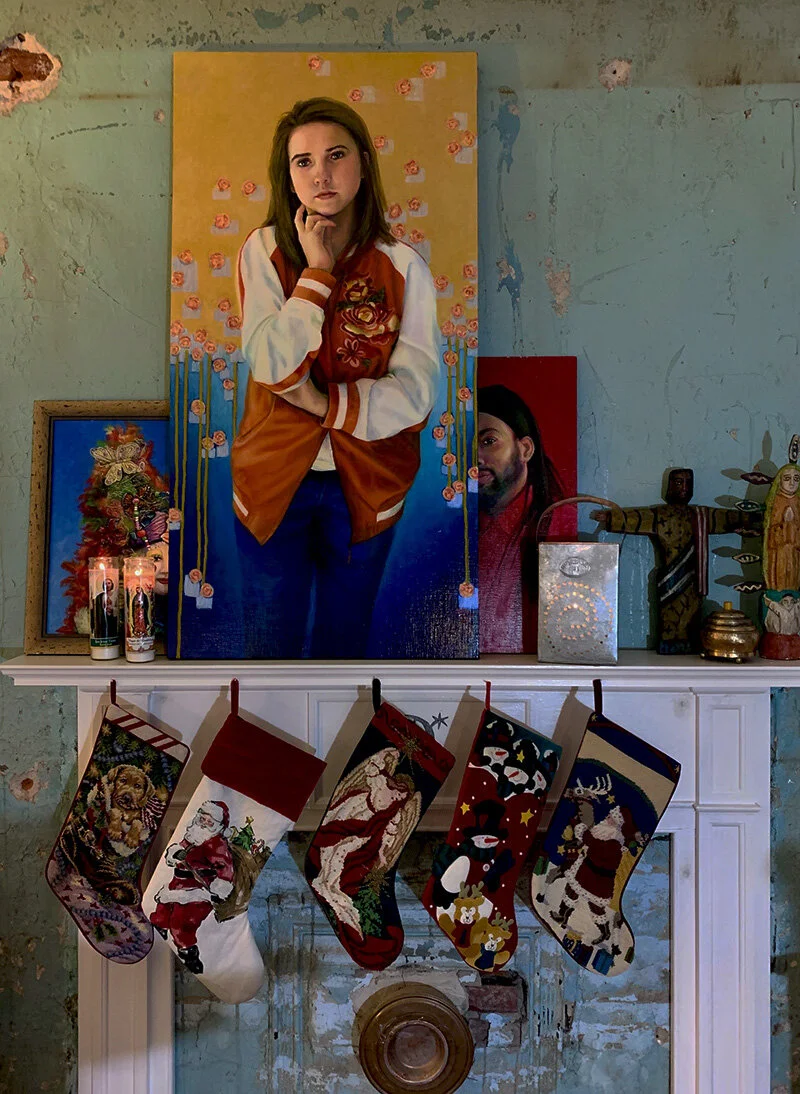
The Florentine School is not just a specific art style … the way the paintings look to the viewer … there’s a lot more to it. It is a tradition that includes not just making art, but also the lifestyle and philosophy around the work. Studio rituals. The painting process. The materials. The way of seeing. All things composition. Interacting with subjects. With clients. With patrons. What you eat and drink. It is the complete commitment to living as a classical artist. It is the often overlooked details … the mark of the studio — how the painting is signed (always in red). It is the reason I call myself Studio C Shute. It is the willingness to face a cold November morning with hope … (and hot mushroom meatball soup for breakfast).

This installment of “The Florentine School” is “making boards” as Ben used to say. It was heavy with process, so we usually devoted most of a day to it, and made multiple boards at one time. Painting on a rigid surface (if using the right materials … the “traditional” ones, of course) is the most archival method. Fresco is actually more permanent, but it’s not really the same thing, since in fresco the pigment is absorbed into the plaster, and does not rest on top of it in a paint film.

Making boards: rabbit skin glue prepared in double boiler, birch plywood, either three-quarters thick or one-quarter mounted on stretcher bars, wood sealed with glue, linen or canvas (always linen for portraits) glued to the board with warm glue starting from the center out, edges wrapped and corner folds done just so, dry for two days at least, light sanding to make sure the paint gets down into the linen fibers, lead white ground, a week or two (minimum) to cure, and then you are ready to paint.

This is my first time prepping boards in the Lockhart StudioKitchen, so I’m just figuring out how this machine will work. Here is a fairly large canvas, 30 by 48 inches, ready … well, maybe late today … for the first layer of ground. This panel is for a landscape commission … a river scene called “The Sand Bar” … which was actually the view outside my wonderful little studio in Fort Gaines. Can’t wait to get started ….

making boards.jpg

Woke Studio

I’ve been painting A LOT in the past few days … and that can become disorienting. I call it losing time — the normal patterns of sleeping-eating-working-day-night … they just fade away. Frankly, it’s a pretty terrific place to be for painting, but not being earthbound for too long just gets weird. So I try to be hyper-vigilant about meditation, which for me is grounding, mostly using the mind-emptying TM approach. Lately I’ve been using techniques with a physical dimensions to the practice, like walking and writing meditations. (note to self: time to finally learn yoga). This morning I’ve been lost in a wonderful poem from Rumi …. handwriting it word for word … step by step … like face to face contact with the ideas one by one.

Very peaceful. So now back to the angstie business of delivering the promise of Venus.

don't go back to sleep.jpg

Still Angstie Over Venus

… woke up this morning way before 5:00 and dashed into the studio …. wondering what on earth I did yesterday. I think I like the direction the background is going. I’m sure I like the symbolism. And I think a viewer could like it even without “the story” … well, if Venus is good … no pressure there!

So that’s what is happening today … back to the figure and the face. It’s usually about 10:00 when the light steadies enough to do some real painting. Dark is ok to studio paint, and light is ok … but those shoulder times are tough … the light moves all over the place. Ok… here we go, Venus.

sty roses.jpg

Floppy Dog Roses

Today has been one of the best days and one of the worst days in the studio … lost in reverie of painting, angstie over how to express an idea, relieved to have finally surrendered to an impulse, and now … even more angstie over how well it all turned out.

All day I’ve been working on the Birth of Venus painting, specifically the background flowers. The original intention had been to render a wide variety of different flowers fairly realistically … suggesting a garden coming into bloom and crowded with randomly distributed vegetation. But I started sketching it out on the canvass this morning, and it just felt wrong … too much noise around the subject, my Venus … perhaps undermining the story I want her to tell. Angstie!

I ended up wiping off hours of work and starting over with a deeper and simpler idea … one I’ve been seeing in my imagination for days. Stylized roses emerging from the deep, blooming at the surface as idea expressed, and following Venus up into the golden day.

Wow … so that’s what I attempted to do … all day drawing and paint sketching roses. I just cleaned the pallet and decided to call it a night, determined to “turn it against the wall” as my teacher used to say when he meant, “you’re too close to it; time to give it a rest” … and I guess it is time to give it a rest when rose doodles over dinner turn into floppy dogs.

rose doodles.jpg

Honey in Progress

Here’s the latest pet sketch, Honey after a couple of sessions. I love these interim levels of finish. Hopefully she’ll be dry enough to work tomorrow … ready to paint some bees.

IMG_1066.jpg

Bee Doodle

… been enjoying the company of these guys all summer.

IMG_1052.jpg

StudioKitchen Saturday Night

Great time today working on Honey … advancing the painting, collecting bee photos, and working (will it ever end!!!?) on the kitchen floor. But it’s already a cozy space … cabin in the country … chili and football … StudioKitchen Saturday night.

SK saturday night.jpg

Honey Bee

Yesterday I rendered the underpainting for a new pet sketch — Honey. I’m using the image of a young Golden Retriever, enormous foreshortened nose, and a floppy-tongued smile. She reminds me, of course, of my beloved Poppy, both having deep honey colored coats. True to my school, the background should derive, at least in part, from studio surroundings. Thus the story of the basil:

Outside the StudioKitchen is a garden … flowers and herbs … Italian parsley, flowering sage, bushy rosemary, lemon thyme, marigolds, knockout roses, purple phlox, multi-colored zinnias, and others with forgotten names. Oh … and also the basil.

The garden did well this summer, thanks to diligent watering. The rosemary really took off, as did the roses. But the uncontested superstar was the basil. Now, I’ve always had good luck with basil, and everywhere I go my basil-power follows. But this year the plants went wild. From humble beginnings … a single seed pack and starter pots from the $1 isle at Dollar General … to a basil forest, crowded with basil trees, and flowering-seed-pod-tipped branches stretching up into the sky. It was, as they say, a sight to behold.

If you’ve had your own basil forest, then you already know this amazing factoid — bees love basil forests. Benevolent bees covered the studio garden all summer. And late in the season, feeling dwarfed by the basil trees for too long, the sage exploded with red flowers … attracting butterflies and hummingbirds … and the place began to feel like a petting zoo.

So Honey is going to have bees in her background … maybe even a bee halo since she looks so much like an angel.

IMG_0979.jpg

Macy Interstellar revised

Commissioned portrait painting, even just a little pet sketch, can be a nervous business.

When a client commissions a work, it’s not enough to execute the painting well, it’s also important to listen to them, understand what it is they want, and deliver something within (or hopefully exceeding) their expectations. Sometimes they say, “just do what you do,” and that’s great … my favorite song! But sometimes they say, “can you find a way to work in my favorite duck decoy?” If I take the commission, the decoy is an important element … and if I don’t see the beauty of the decoy, I shouldn’t even try to do the portrait. In fact, I’ve turned down several commissions over the years because the client wanted something outside of my range … a composition or style that doesn’t fit my voice … something that didn’t feel right to me. I can still hear my teacher Ben Long saying, “If you sit down with a subject and you don’t feel beauty there, walk away … you’ll never paint a beautiful picture.”

So when the client likes the work, it’s always a wonderful feeling, mostly relief, but also, for some reason a wee bit of surprise.

Joni has commissioned quite a few pet sketches over the years; and of course, she’s good about ordering Christmas gifts in September! As is the usual process, she sends me several photos of the pet, I pick one image to use as a source for the subject, and tend to make up the background based on whatever happens in the studio at the time.

For Macy Interstellar I was watching space movies while painting. I generally watch movies or listen to books to keep my conscious mind occupied so my subconscious can drive the bus, so to speak. For me, thinking too much is the perfect way to spoil a painting. Since events in the news are mind-bending these days, it’s feeling sensible to leave the planet altogether. Space movies.

Joni loved the painting, and particularly the interpretation of the globe in the background … an object that really was on the source photo. Turns out the globe was a treasured gift from Joni, and she was thrilled to see it celebrated with Macy Interstellar. Whey!!!! After seeing it, she asked if I could add an airplane since the recipient works for United Airlines. Absolutely. What a great idea. So this is Macy Interstellar revised.

Macy Interstellar.jpg